
SaverLife Member Median Spending Dashboard
How to Use this Dashboard:
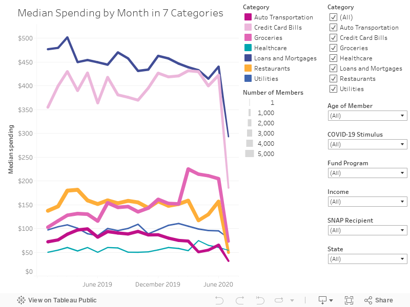
This dashboard is updated weekly to show the median spending across select categories. For more detail about any data point, you can hover over the datapoint on a computer, or tap on a mobile device. Filters allow you to sort the data. The thickness of the line indicates how many SaverLife members had spending in that category.
* Note that major dips in the most current month may simply be an indication that we’re only mid-month. Data for the existing month is typically incomplete until 5 business days following the month end.
What We See:
In April, spending was modestly lower for auto-related expenses, yet far higher in grocery spending, a continuing trend. It also appears healthcare spending in April ticked up, a month later than we typically see it.
While it is still too early to make any concrete assumptions about May, it appears a pattern may be emerging that people are making smaller credit card, loan and mortgage payments.